Introducing MUI X v6.0.0
José Freitas
@joserodolfofreitas
MUI X v6.0.0 is finally here with many improvements, new features, customization abilities, and a more robust foundation to accommodate the changes we want to deliver next.
✨ Features highlights ✨
Data Grid
ApiRef now available for all users
Manage pagination, scrolling, state, and other attributes through the Data Grid's API object—previously available only in commercial plans, now accessible to all.
The apiRef enables developers to implement a whole new range of customizations that rely on programmatic control of the Grid's features.
function CustomDataGrid(props) {
  const apiRef = useGridApiRef();

  return (
    <div>
      <Button onClick={() => apiRef.current.setPage(0)}>
        Go to page first page
      </Button>
      <DataGrid apiRef={apiRef} {...other} />
    </div>
  );
}
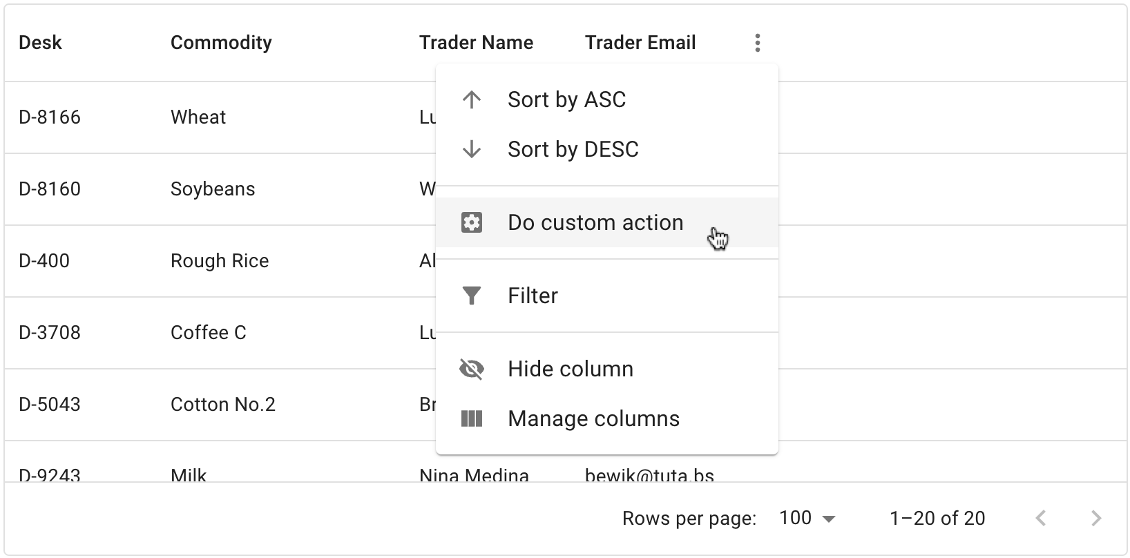
Improved column menu
Another significant step in terms of customization but also usability; the v6 column menu now provides support for icons, menu groups, custom items and actions, and more. We've redesigned this sub-component to make it as extensible as possible.
This is part of an overarching effort throughout the life cycle of v6 to refactor all Data Grid panels.
Cell selection
Select a cell or group of cells like in an Excel sheet. Cell selection is a powerful and flexible way to select data in the Data Grid. It's also the base for bulk editing and clipboard importing (coming soon).
Stable Aggregation and Row pinning
These two features have been previously released in a minor v5 version under the experimentalFeatures flag.
Now they are officially stable.
Date and Time Pickers
Overhaul in the documentation
The Date and Time Pickers documentation has drastically improved during pre-release, and it now features a more comprehensible navigation structure and many new examples.
Improved layout customization
Combining the slots concept with the grid layout, you can now rearrange, extend, and customize most of the sub-components used in the Pickers UI.
function MyCustomLayout(props) {
  const { toolbar, tabs, content, actionBar } = usePickerLayout(props);

  // Put the action bar before the content
  return (
    <PickersLayoutRoot className={pickersLayout.root} ownerState={props}>
      {toolbar}
      {actionBar}
      <PickersLayoutContentWrapper className={pickersLayout.contentWrapper}>
        {tabs}
        {content}
      </PickersLayoutContentWrapper>
    </PickersLayoutRoot>
  );
}
export default function CustomStaticDatePicker() {
  return <StaticDatePicker slots={{ layout: MyCustomLayout }} />;
}
Fields: the new default input for Pickers
These rich text fields are specialized for date and time logic and offer quick navigation and isolated interaction within each section of a date value.
Shortcuts for picking specific dates in a calendar
Add quick and customizable shortcuts for your users. Particularly useful for date ranges. Display them on the left, right, bottom, or top.
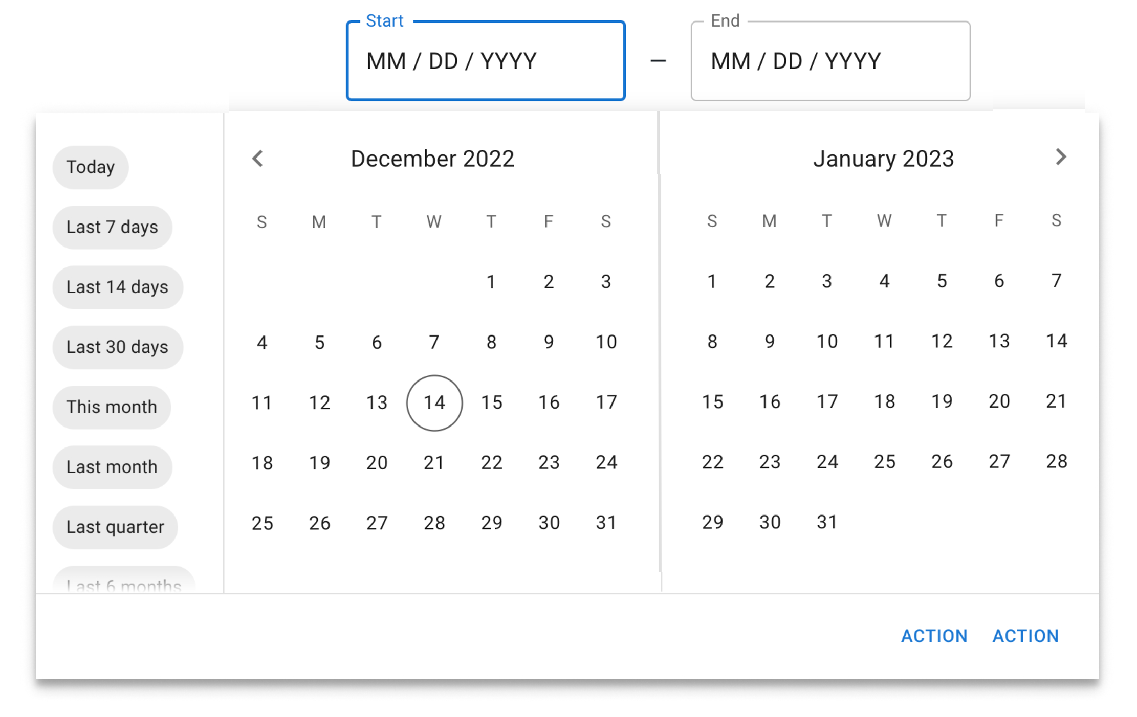
Edit date ranges with drag and drop
Editing a date range is even easier now with the new drag-and-drop interface. Change start and end dates at will.
Removed clock view on desktop Time Pickers
Many users complained, and we completely agree, the clock view is not the ideal time-picking experience on Desktop, so we removed it as a default view. You can still use the Clock if you like to, but a replacement UI for the time picker is coming shortly after this release.
Installation and migration
If this is your first try with MUI X, you can jump in the getting started section:
If you're coming from previous versions, we recommend you check our migration guide with the complete list of breaking changes:
We also provide codemods to automate some of the necessary updates in your codebase.
npx @mui/x-codemod v6.0.0/preset-safe <path>
What's next?
We operate in a continuous-delivery environment, so the plan is to keep rolling out new features in minor versions.
With the new base established in v6.0.0, we'll continue our efforts to improve UI/UX, bring more customization abilities, and support new use cases.
Here's a list of what you can expect to be delivered in the following months (what is next on our immediate roadmap).
Data Grid
- Clipboard importing
- Filtering on header
- Row spanning
- Improved Panels
- Column Management panel (column visibility, reordering, grouping, pinning, etc).
- Filtering panel
- Support for Joy UI
Date Pickers
- Time Picker replacement for the clock on desktop
- Time Range Picker
- Date Time Range Picker
- Ability to select a month range in the Date Range Picker
- Support for Joy UI
Charts 📊
- Preview of chart components 🔥
You can get more details of our next steps in MUI X public roadmap.
Decoupling versions from MUI Core
We're officially decoupling MUI X's versioning from MUI Core (including @mui/material: Material UI). We understand that this may cause confusion, so we'd like to explain the main reasons why we're moving in this direction.
Soften migration pains with a yearly release cycle.
The MUI X codebase is very dynamic, and the constant development of new features often requires more breaking changes. With a yearly release, we aim to deliver those in smaller, more digestible sizes, in a time window that you can rely on to make your plans and prepare for updates.
We aim to support not only Material UI but also Joy UI and, in the future, MUI Base.
Feedback
We appreciate all of your feedback throughout the development of this new version. It's been vital for our process and always will be, so please continue to share your thoughts as we work through our next steps.
We're continuously doing user interviews, so if you'd like to share your pain points and use cases, please leave your contact info. As usual, you're welcome to join the discussion by requesting or commenting on new features, or reporting bugs in our GitHub repository.
Cheers!